Brand Strategy | Naming | Brand Positioning | Brand Identity | Brand Guidelines | Corporate Comms | Environmental Design | Marketing Strategy | Tone of Voice | Brand Film
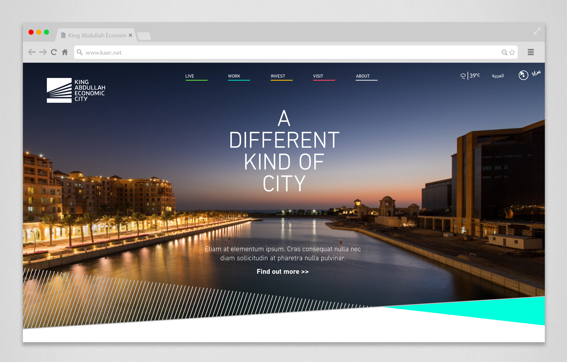
The Saudi city of KAEC sits on the beautiful shores of the Red Sea and balances beauty with a thriving commercial scene. Back in 2006, we were briefed to create a brand underpinned by trust and credibility that would position the city as a solid proposition for long-term investment and as a credible partner for public and private sector organizations.
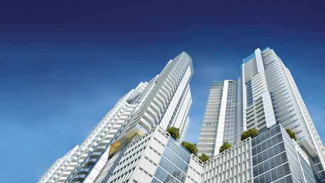
With its immaculate landscapes, sparkling seas, peaceful neighborhoods and bustling shops as well as many opportunities for education, business and recreation, KAEC rivals many of the main cities in Saudi Arabia when it comes to quality of life. However, awareness of the city and its offer was low amongst the wider population. It was our job to bring the vibrancy and diversity of the city to life through a compelling new visual identity.
We were keen to breathe new life into the original brand elements. At launch the city was branded using its full name – King Abdullah Economic City – to help drive understanding of its founding purpose.
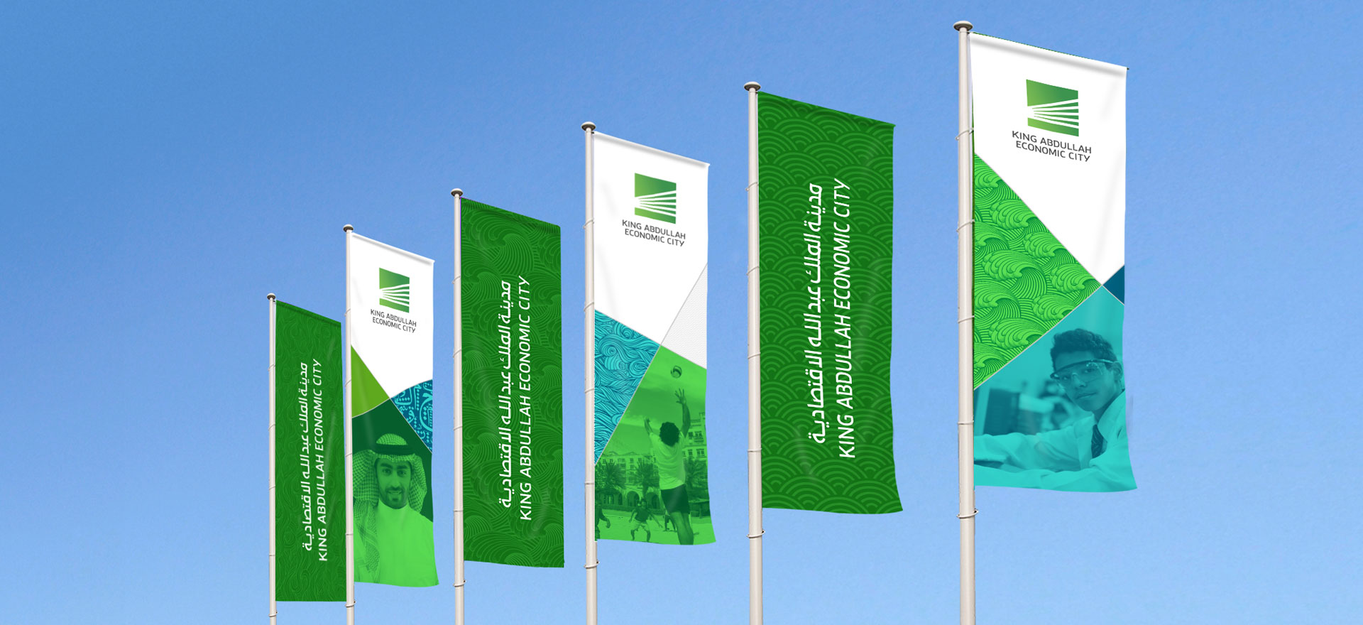
We drew inspiration from the original brand symbol, a series of light beams breaking through a solid square. By deconstructing the light beams, we created a new visual language that captures the city’s sense of progression, vision and optimism. Each beam of light represents a different aspect of this dynamic place and through its application, acts as a spotlight on the city and its broad offering. A diverse and vibrant colour palette added an ever-changing attitude to brand communications.
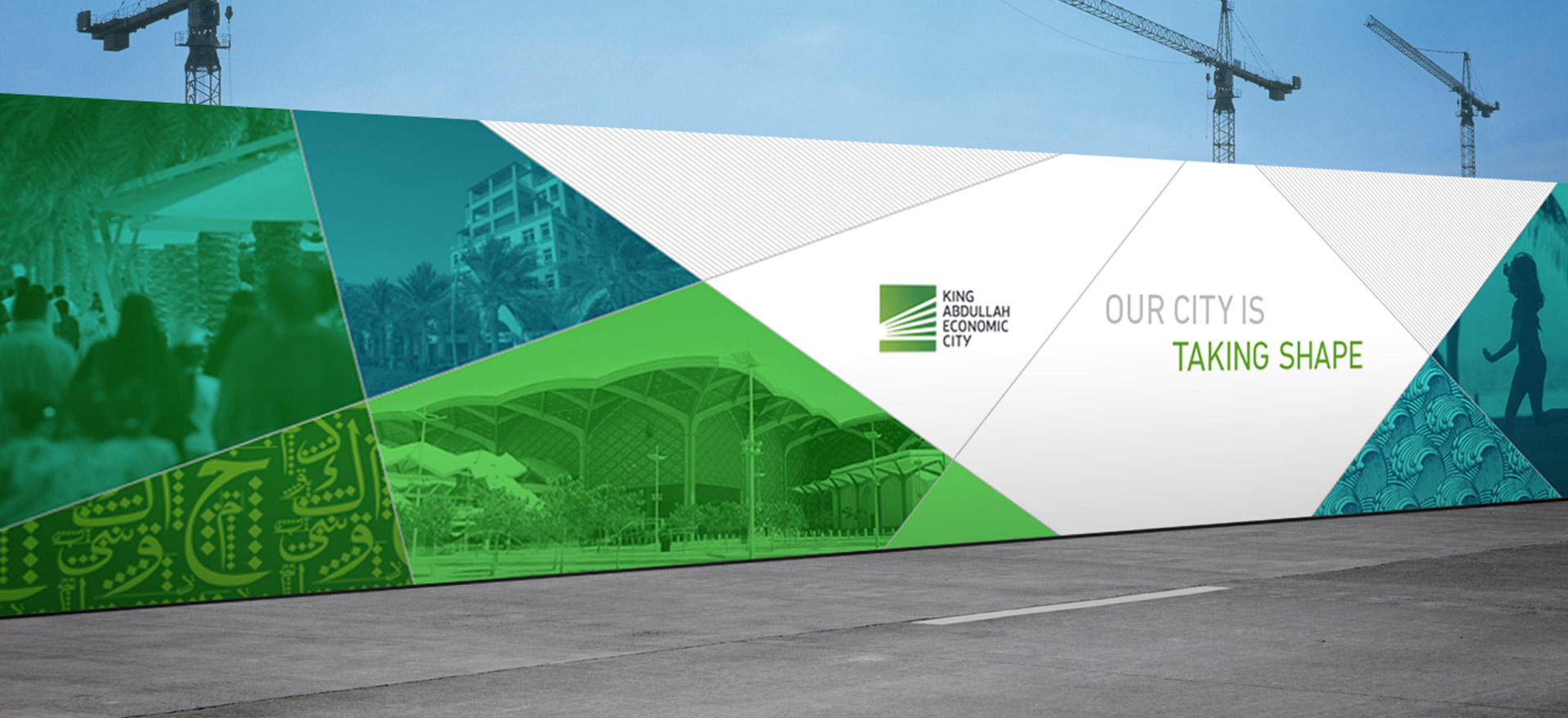
The launch of the city’s vibrant new look and feel was timed to coincide with the inaugural Saudi International, a major international golf event. With the city in the spotlight, we worked closely with the KAEC team on a national wider reaching campaign, bringing the brand to life across every possible touchpoint within the city.