Brand Identity | Motion Graphics | Brand Guidelines
Eurovision is an iconic event in the broadcasting calendar, attracting an audience of 180 million viewers each year. After a creative pitch, we were briefed to design the visual identity for the Eurovision Song Contest in Düsseldorf.
An iconic event demands an iconic identity. Each year, the contest is given a unique identity inspired either by the host city or an associated theme – in this case feel your heartbeat. This concept is applied to every aspect of the event, from the look and feel of the television coverage to the TV crew’s identity tags.
Our brief was clear. When Lena Meyer-Landrut won Eurovision for Germany with Satellite, she famously made a heart-shape with her hands to express her gratitude to voters. This gesture inspired the Eurovision strapline for Düsseldorf: ‘Feel Your Heart Beat’. Producers, Brainpool and host network, NDR wanted an identity that told the story of the strapline in an exciting and meaningful way.
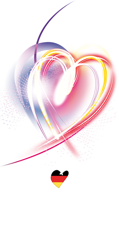
The energy behind Eurovision is palpable. Our aim was to visually capture the energy of the performers on stage, as well as the millions of fans throwing Eurovision viewing parties around the world. The result was a heart-shaped central mark made from dynamic, multicoloured beams of light showing the many nations coming together for the contest.
The final identity was rolled out across all brand touchpoints, including broadcast graphics, environmental design, social media and print applications and helped drive viewer engagement around the world as well as civic pride in the City of Düsseldorf.