Articles | Branding
The new look for the two leagues has been developed by Turquoise Branding studio, and will be used across broadcast, communications, stadiums and more.
London-based branding studio Turquoise has unveiled new branding for the UEFA Europa League and the soon-to-be-launched UEFA Europa Conference League.
The Europa League in its current state was established in 2009, and is the second-tier of European club football after the Champions League. This year sees the league restructured however, with the number of teams involved streamlined from 48 to 32.
A new third-tier competition for a further 32 teams is being established this year as well: the UEFA Europa Conference League.
Turquoise was invited to competitively pitch for the branding project, having previously worked with UEFA. Past projects served to “build a good understanding of the needs and requirements” of the footballing authority, according to Turquoise creative director Gareth Mapp.
The brief was to refresh the UEFA Europa League branding in line with the restructuring as well as developing a new “sibling” identity for the Conference League, Mapp says. He adds the branding for the former needed to reflect it becoming “more competitive with fewer teams”, while the latter needed to reference its “more open and inclusive characteristics”.
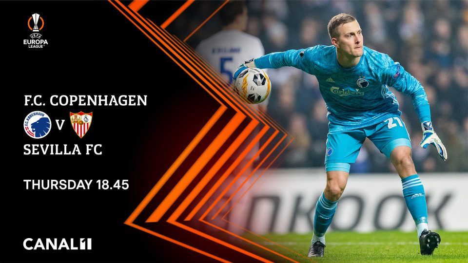
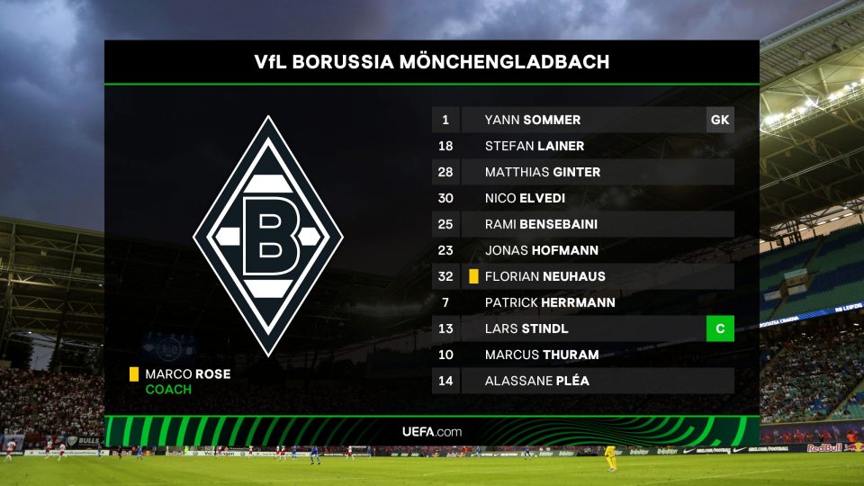
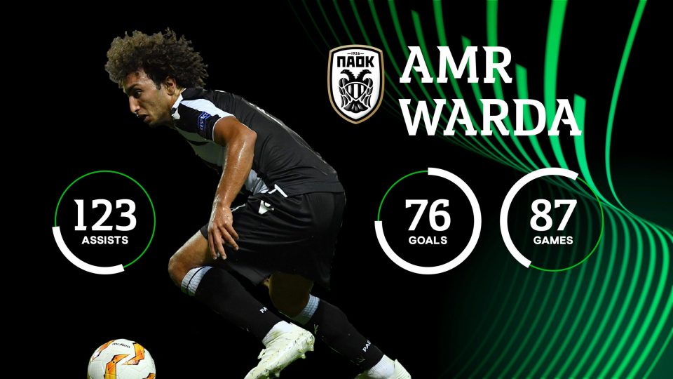
While distinguishable as two separate leagues, the identities still needed to work harmoniously together, Mapp says. The main component of both brands is the energy wave, which was originally introduced to the Europa branding in 2015. This was conceptualised to represent the noise and passion of fans chanting at stadiums, according to the designer.
The wave motif is a necessarily flexible brand device to work with. “We wanted to avoid any ‘generic’ football imagery, footballs and footballers,” says Mapp. “UEFA club competitions are about a unique and compelling European footballing experience that is experienced by many different audiences across a diverse range of touchpoints.”
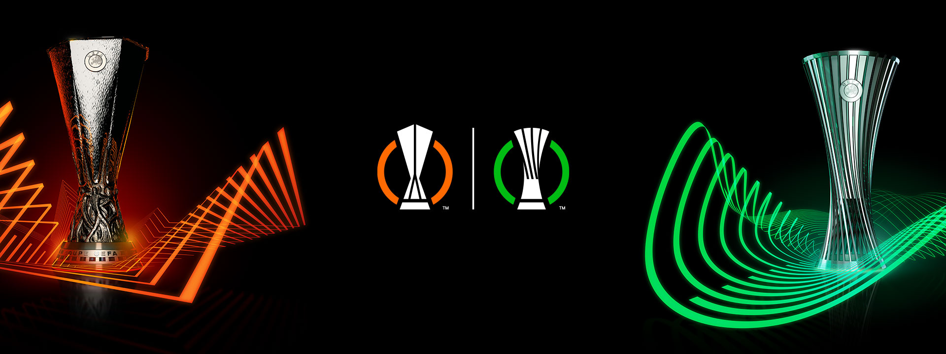
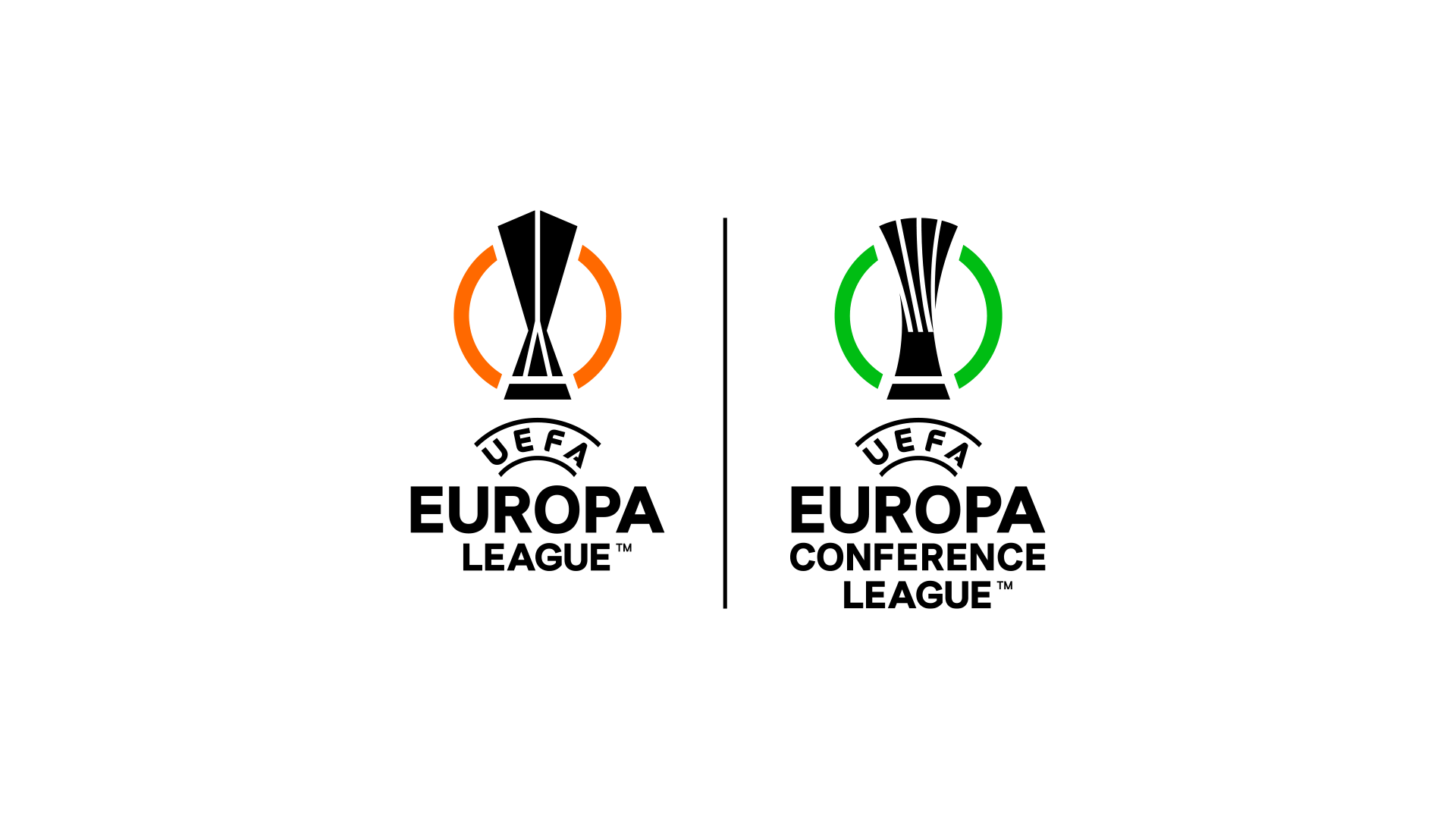
Two new logos have also been drawn up. The UEFA Europa League logo uses angular geometry, which mirrors the design of the competition’s trophy. Meanwhile the new UEFA Europa Conference League logo features curved geometry, in line with the new competition’s more “fluid” trophy.
Beyond the shapes, the two logos are differentiated by colour. The Europa League branding retains its orange colour, though this has been refined, according to Mapp, as there were too many variations previously. The Conference League uses a bright green colour – this allows the brand to “stand out” from its “sibling”, while still “matching the same energy” with a bright colour Mapp says.
The logos will feature alongside the branding across a wide range of touchpoints. These will include social media, brand communications, stadium perimeter boards, merchandise and broadcast graphics.
Some elements of the previous Europa branding have been reused for the two new looks. The music developed for the original competition has been extended to the new Conference League – this has created an “anthemic experience” Mapp says.
Additionally, the brand typefaces, Europa Title and Europa Nuova, have been retained by Turquoise. Initially, there was talk of introducing a new typeface to differentiate between the two tournaments, but Mapp says this was decided against in the interest of “visual cohesion”.
However, other elements have been reworked. Mapp says the UEFA Europa League logotype is one example. “We needed to ensure that the design of the new logotypes were optimised for use as on-screen bugs within the match graphics and as avatars within social media,” he says. “We ended up creating a simpler and bolder logotype system that worked across both competitions.”
In the same vein as the logo, the logotypes take their inspiration from the different angles of the competition trophies. “The end result is a set of logotypes that now work perfectly at small sizes in both digital and broadcast media,” Mapp adds.
