Brand Identity | Motion Graphics | Title Sequence | Typeface Design | Broadcast Toolkit | Brand Guidelines | Environmental Design | Stadium Branding | Merchandise Design | Social Media
In 2021, we developed a unified brand identity system for both the UEFA Europa League and the newly launched UEFA Conference League. Now, as European club football enters the 2024-25 season, the landscape is set for significant change with the introduction of a new competition format – a single qualifying league leading into the knockout stages – spanning all UEFA men’s club competitions, aimed at improving their competitiveness and excitement.
Reflecting the new competition format, the challenge was to elevate the UEFA Europa League identity, making it more premium and dynamic. To achieve this, we’ve introduced exciting new elements to the brand toolkit, ensuring they can flex across a diverse array of touchpoints, from stadium branding and merchandise to broadcast graphics and social media.
We evolved the logo to further distinguish the two leagues. The holding circle was transformed into an octagon, echoing the shape at the top of the UEFA Europa League trophy. Additionally, the typography was given more angular characteristics to align with the overall brand aesthetic.
The UEFA Europa League is one of the most dynamic, ambitious and thrilling events in European football, where the clash of footballing forces sparks drama, passion, and excitement.
We harnessed this energy to introduce bold new elements into the brand toolkit, enhancing its versatility and expanding its appeal to a wider audience.
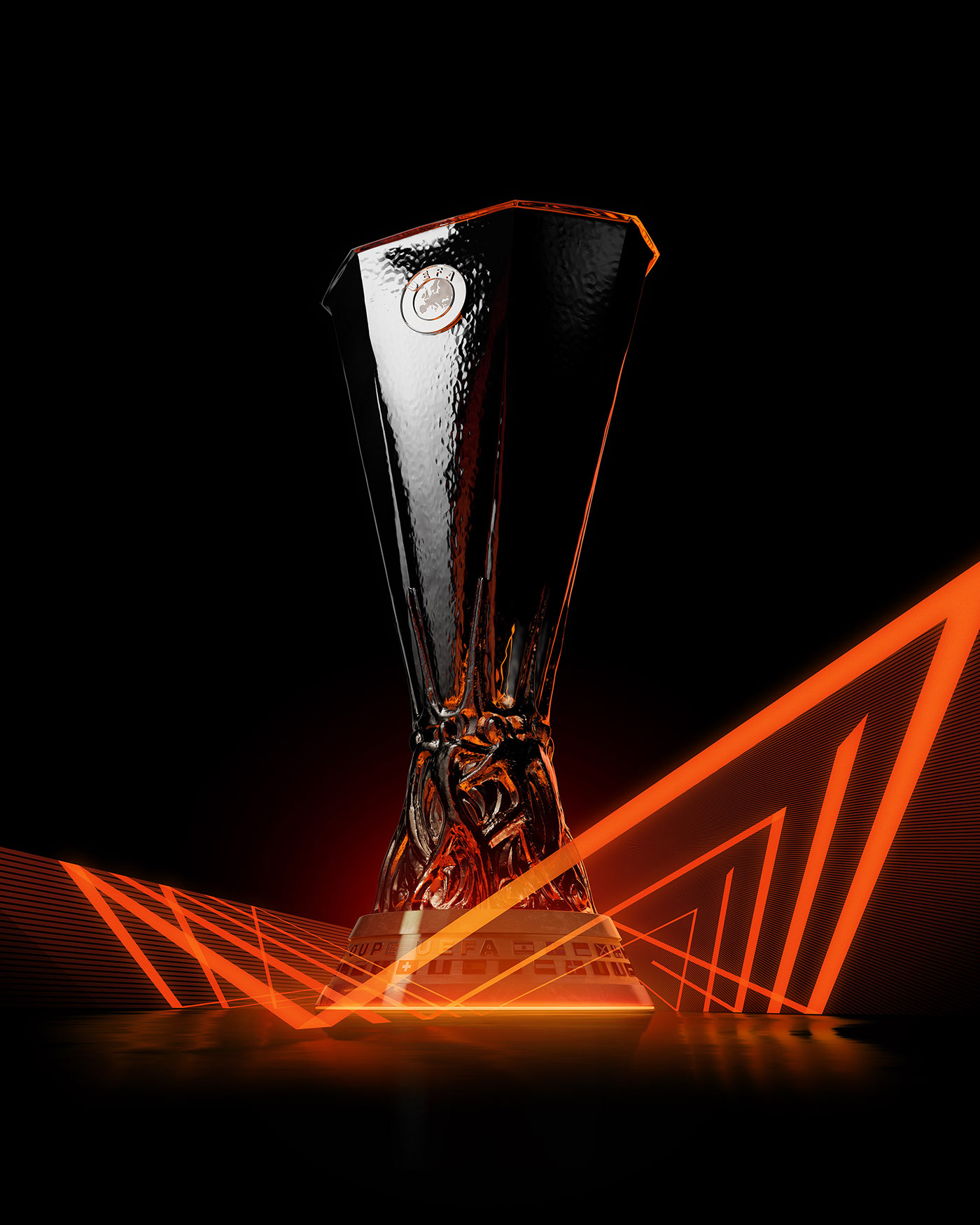
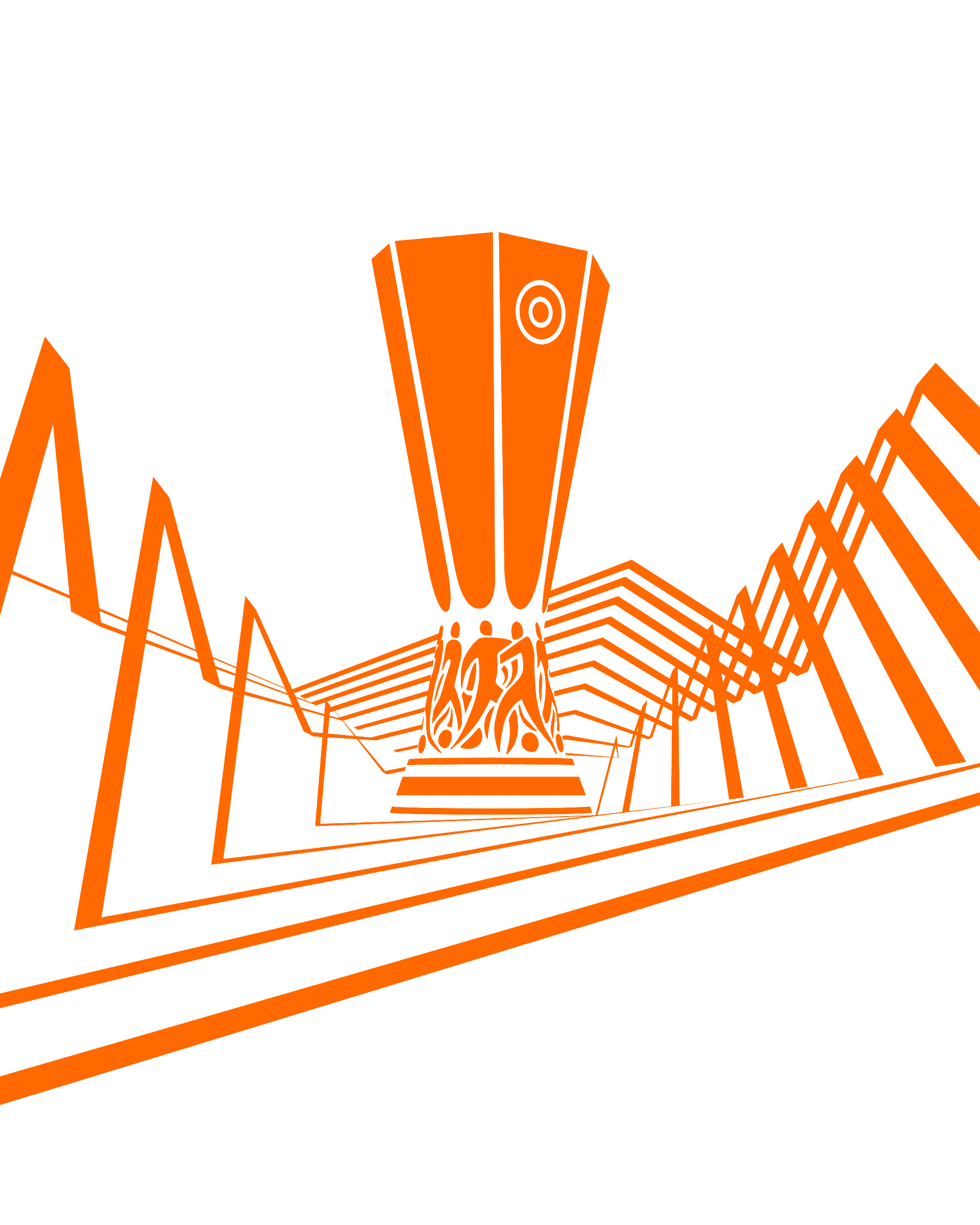
By refining the trophy and energy wave visuals, we created more premium assets, and we fused graphic energy waves together into dynamic pattern designs. The result is a richer, more engaging, and energetic brand experience.


Dynamic new typefaces were created in collaboration with ArillaType®.
We extended the Europa Title family, originally developed for a previous iteration of the UEFA Europa League, by introducing energetic, variable widths to give the brand a more versatile and expressive voice.
To complement this, we developed Europa Strike, an expressive script typeface that captures the passion and intensity of the competition.
The full extended brand toolkit comes to life on social media. We used the energy wave patterns and typefaces to create a huge, vibrant array of templates – ranging from tables, fixtures, stats and in-match posts, to more irreverent content.
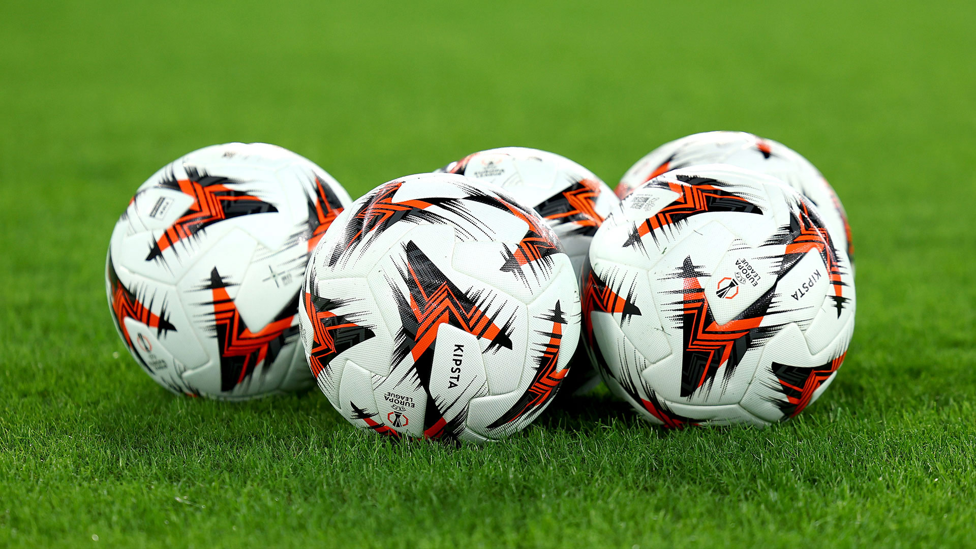
Match ball designed by KIPSTA, the official match ball supplier of the UEFA Europa League.

We built upon the existing licensing toolkit, specifically for merchandise, overhauling it to provide partners with a wealth of new, combinable assets. These updates include premium and expressive assets that cater to a broader fan base. Additionally, we introduced a new character, Spike, designed specifically to appeal to younger fans.
Integrating UEFA Europa League branding with club assets and colours gives clubs the opportunity to tailor their merchandise and maximise sales for each match night. We created an upgraded system that allows the recolouring UEFA Europa League assets for bold, attractive designs.
We created an extensive collection of guidelines to aid stakeholders, partners and clubs in utilising the improved brand toolkit to create dynamic designs with an emphasis on coherency, not consistency.