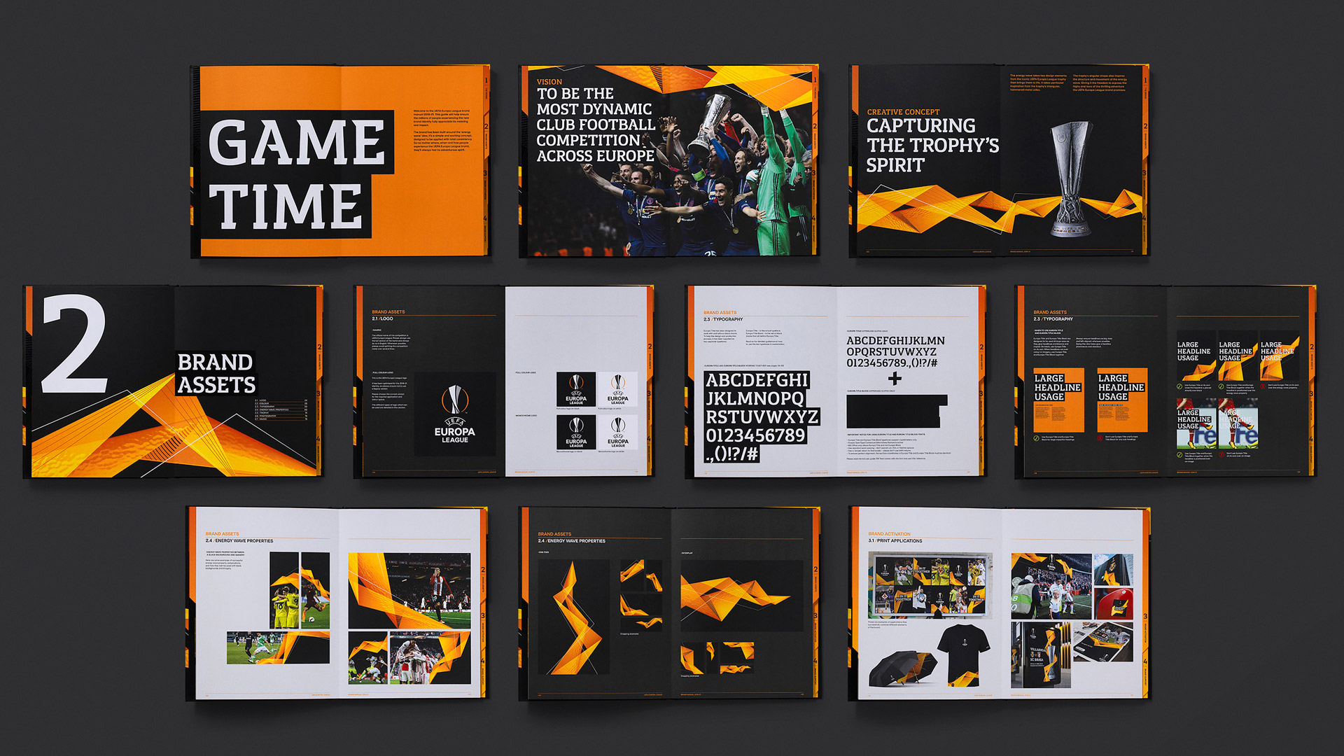
Brand Audit | Visual Identity | Tone of Voice | Broadcast Toolkit | Title Sequence | On-Air Promotional Package | Match Graphics | Social Media | App Design | Stadium Branding | Merchandise Design | Launch Strategy & Activation | Brand Film | Brand Guidelines
Our brief was to capture the high-octane drama of football’s most unpredictable competition for the 2018/19 season by refreshing the Europa League visual identity.
Made up of 48 individual clubs, the UEFA Europa League is known for its unpredictability and is one of few football competitions where David really can beat Goliath. Taking place across the whole of Europe, it’s a major event in the lives of loyal fans from all corners of the continent. Our job was to capture the scale of the competition and its unique spirit in a refreshed identity.
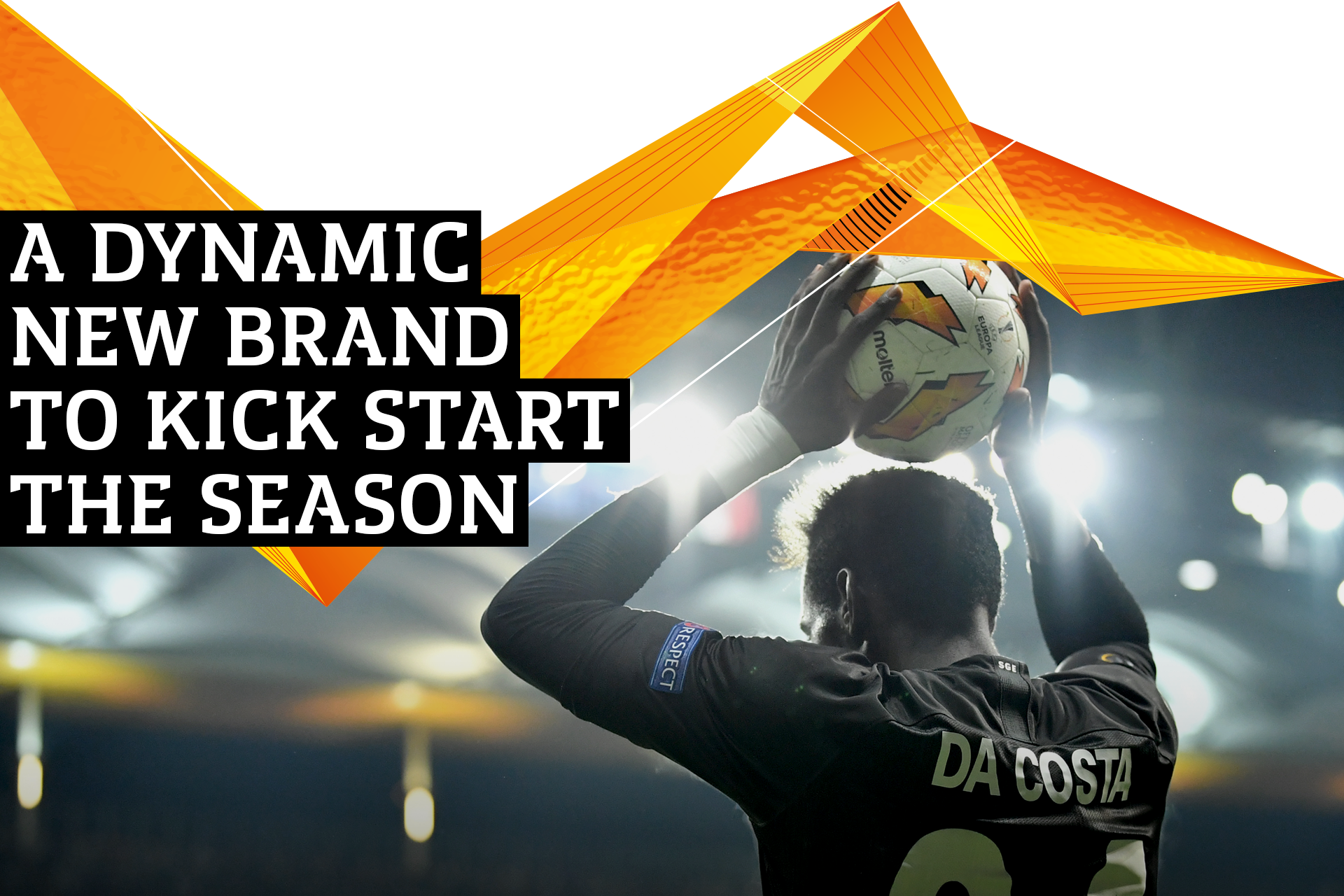
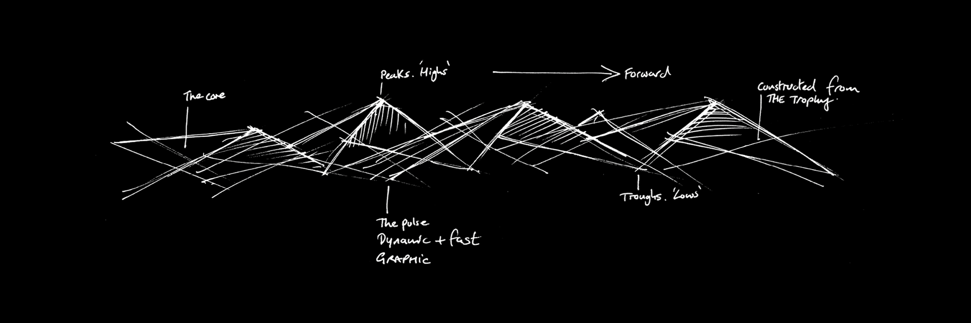
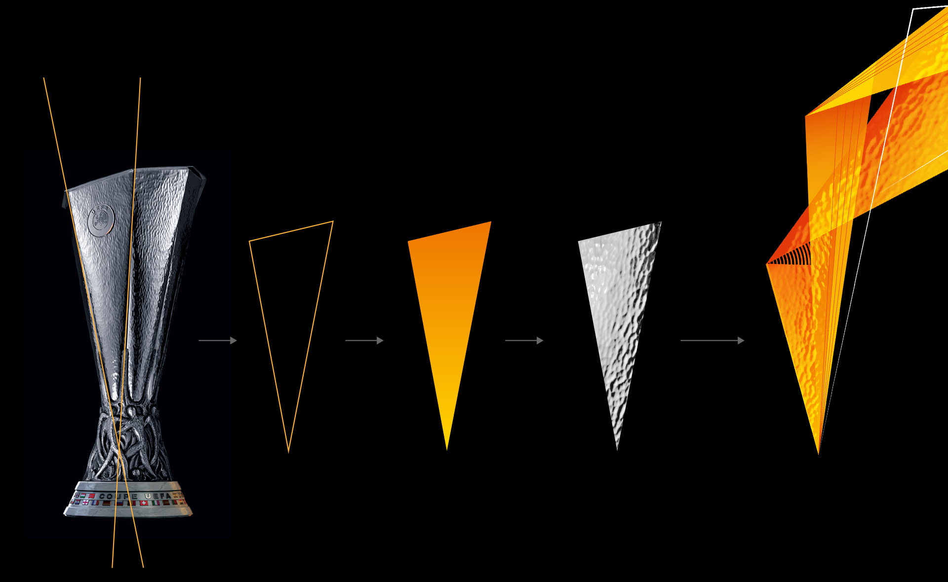
We reimagined the energy wave as the primary branding element supported by a new bespoke typeface and fresh colour palette. The wave evolved into a multi-polygonal form that moved in dramatic and unexpected ways, reflecting the highs and lows on and off the pitch. Taking inspiration from the iconic UEFA Europa League trophy, we referenced its triangular sides with their hammered metal texture when creating the shape and texture of our wave.
Our solution needed to be universal in appeal, transcending borders, rivalries and languages yet retain the original logo. Our response was to create a refreshed identity inspired by a sporting icon that represented the energy and buzz of the game.
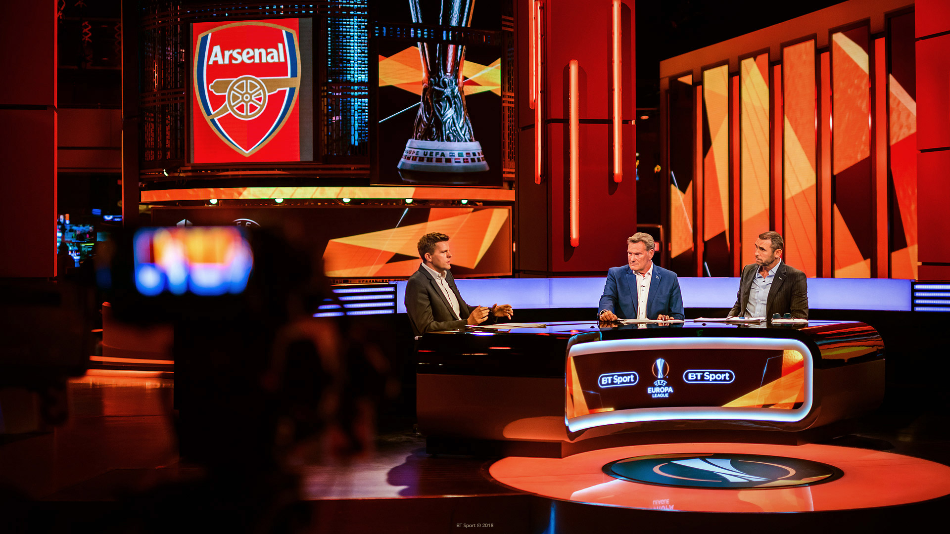
In the lead up to the competition, the refreshed identity was rolled out across multiple touchpoints – from large scale stadium branding and merchandise to match graphics and social media templates – all aided by comprehensive guidelines.
